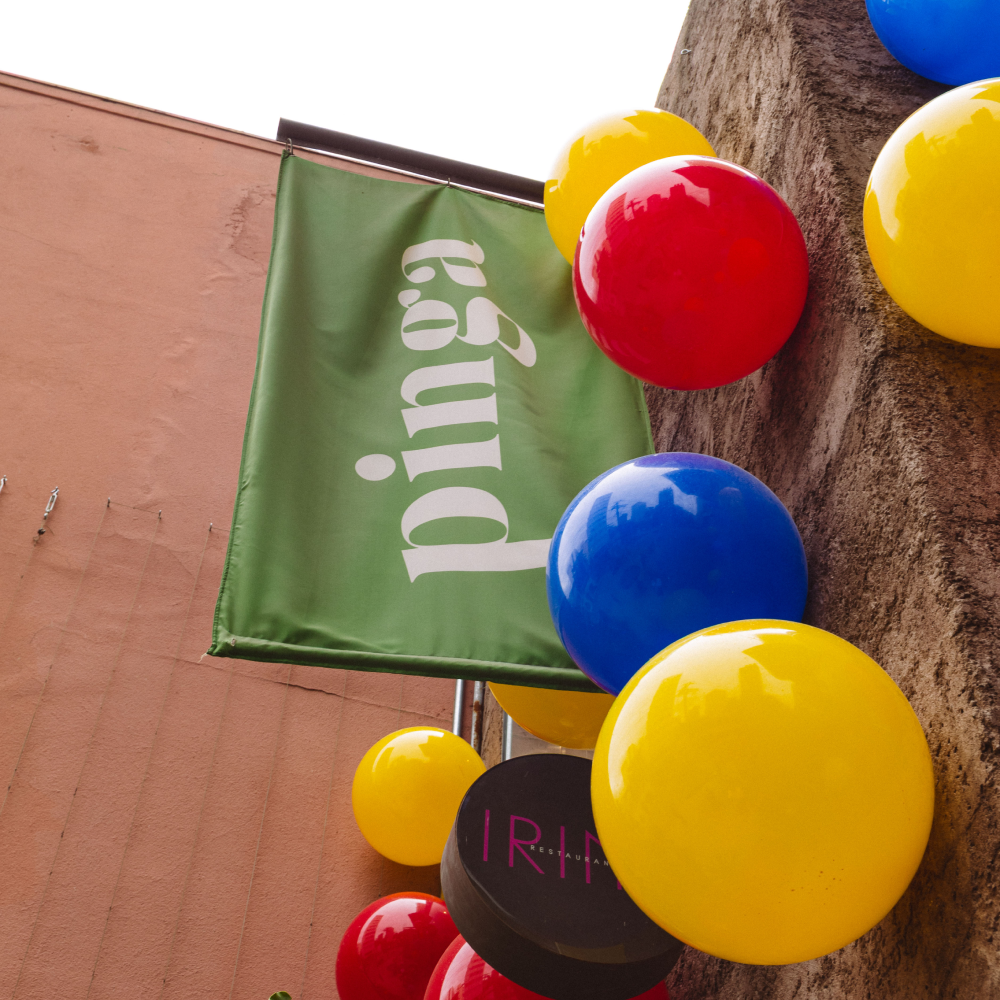
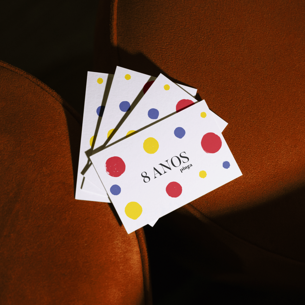
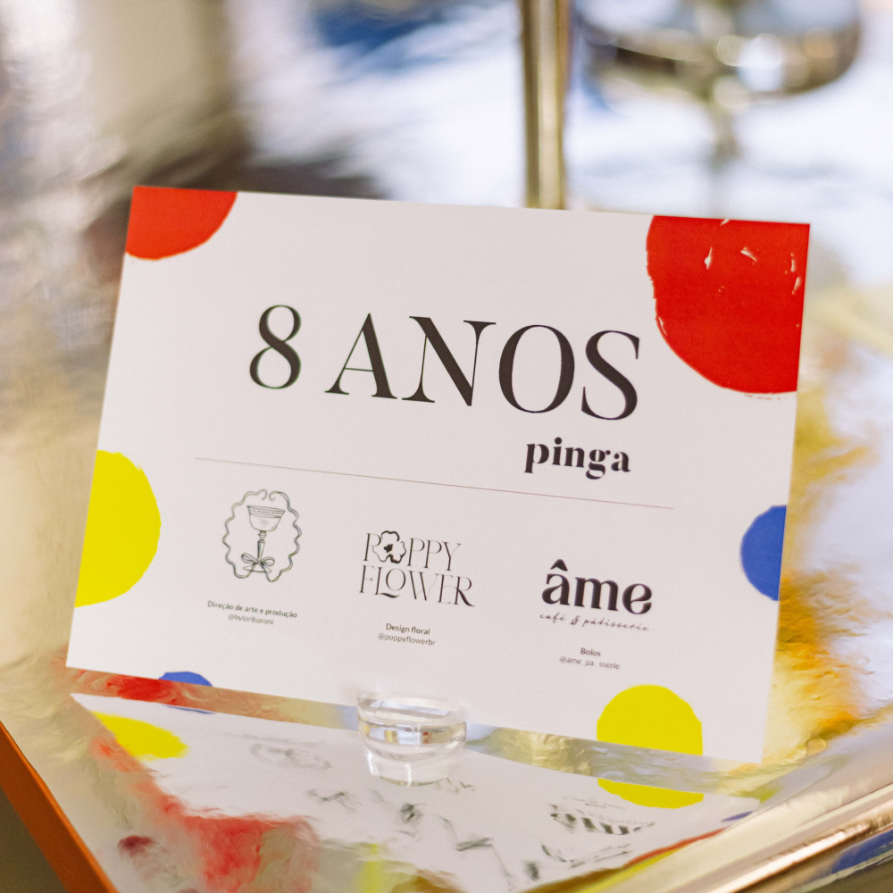
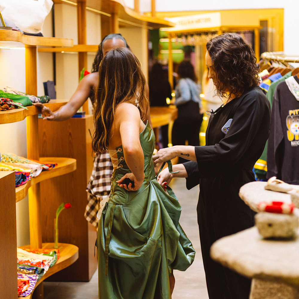
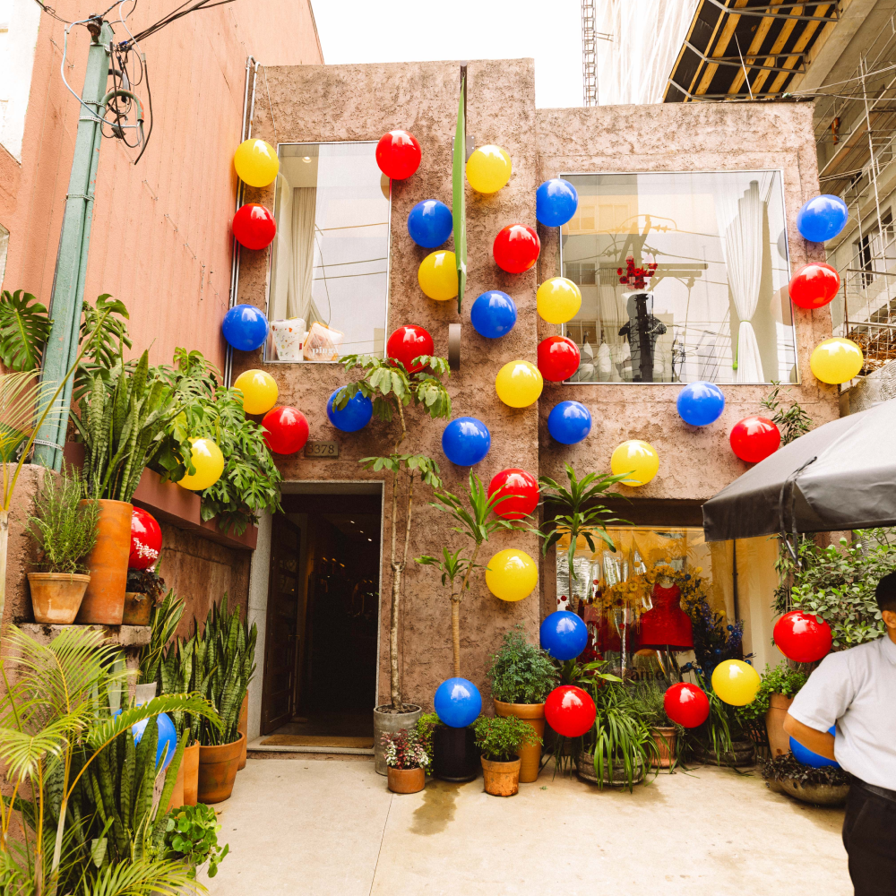
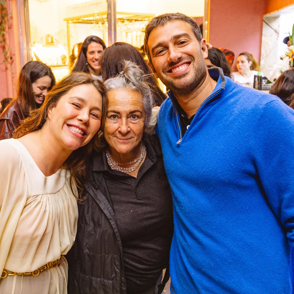
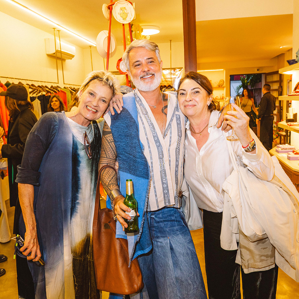
Pinga 8 Anos
Pinga stands at the epicenter of Brazil’s independent fashion, nurturing new ideas and connecting emerging designers with consumers seeking originality. More than a retail space, it operates as a cultural platform that elevates local talent and translates a distinctly Brazilian lifestyle into exclusive pieces.
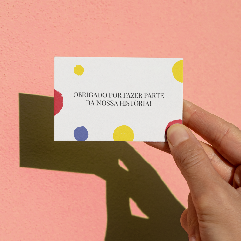
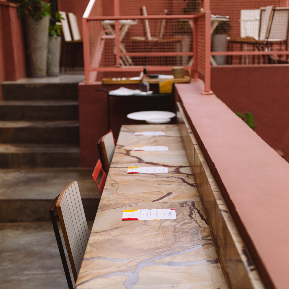
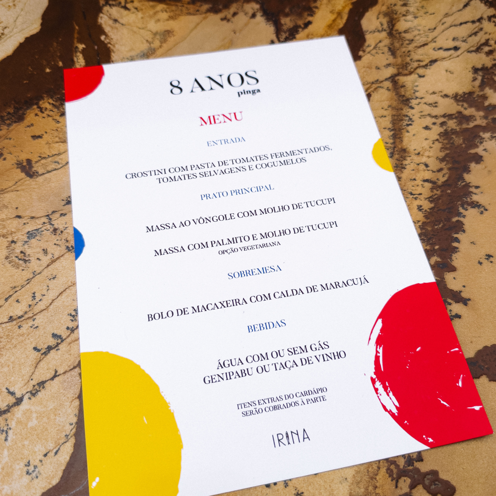
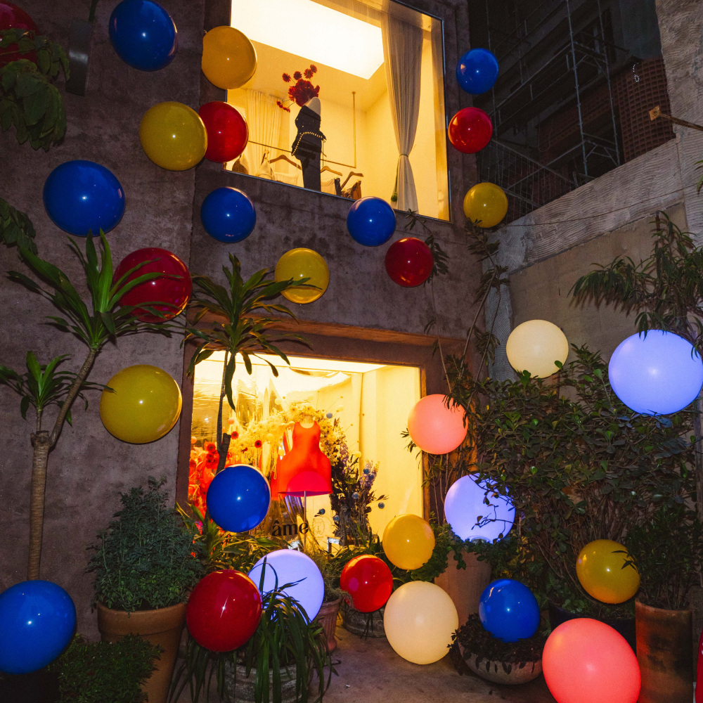
For the brand’s 8th anniversary, we created a visual identity inspired by Kandinsky’s abstract compositions. Floating circular shapes capture Pinga’s playful energy and constant reinvention, while the primary colors and brush-like typography evoke a spontaneous, hand-crafted artistic gesture.
The result is a celebratory system that positions Pinga as a living, evolving universe of color and expression, reinforcing its role as a catalyst for innovation in Brazilian independent fashion.
Pinga stands at the epicenter of Brazil’s independent fashion, nurturing new ideas and connecting emerging designers with consumers seeking originality. More than a retail space, it operates as a cultural platform that elevates local talent and translates a distinctly Brazilian lifestyle into exclusive pieces.
For the brand’s 8th anniversary, we created a visual identity inspired by Kandinsky’s abstract compositions. Floating circular shapes capture Pinga’s playful energy and constant reinvention, while the primary colors and brush-like typography evoke a spontaneous, hand-crafted artistic gesture.
The result is a celebratory system that positions Pinga as a living, evolving universe of color and expression, reinforcing its role as a catalyst for innovation in Brazilian independent fashion.
@Pinga @November 2025
![]()
![]()
![]()
![]()
![]()
![]()
![]()
![]()
![]()
![]()
![]()
ÃO LAPI 2025
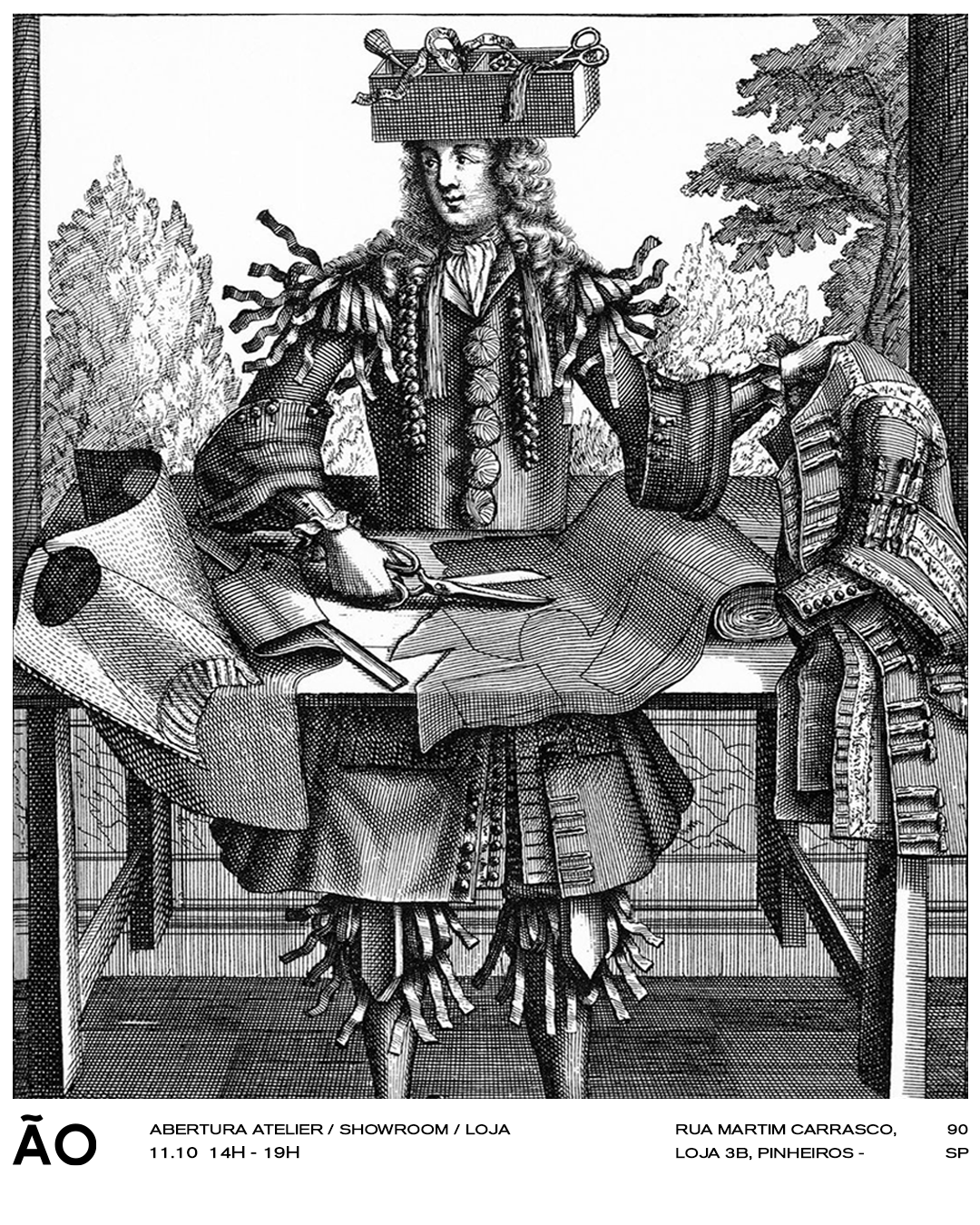
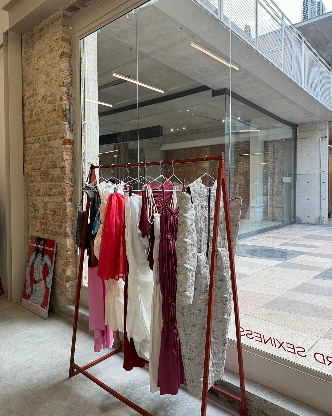
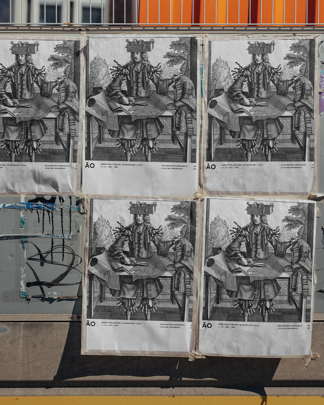
For the opening of ÃO’s new atelier–store–showroom at LAPI, I designed the launch poster that introduced the space to the public and marked a new phase of the brand’s physical presence. The visual concept appropriates an 18th-century engraving of a tailor, recontextualized as a symbolic bridge between craftsmanship and contemporary design.
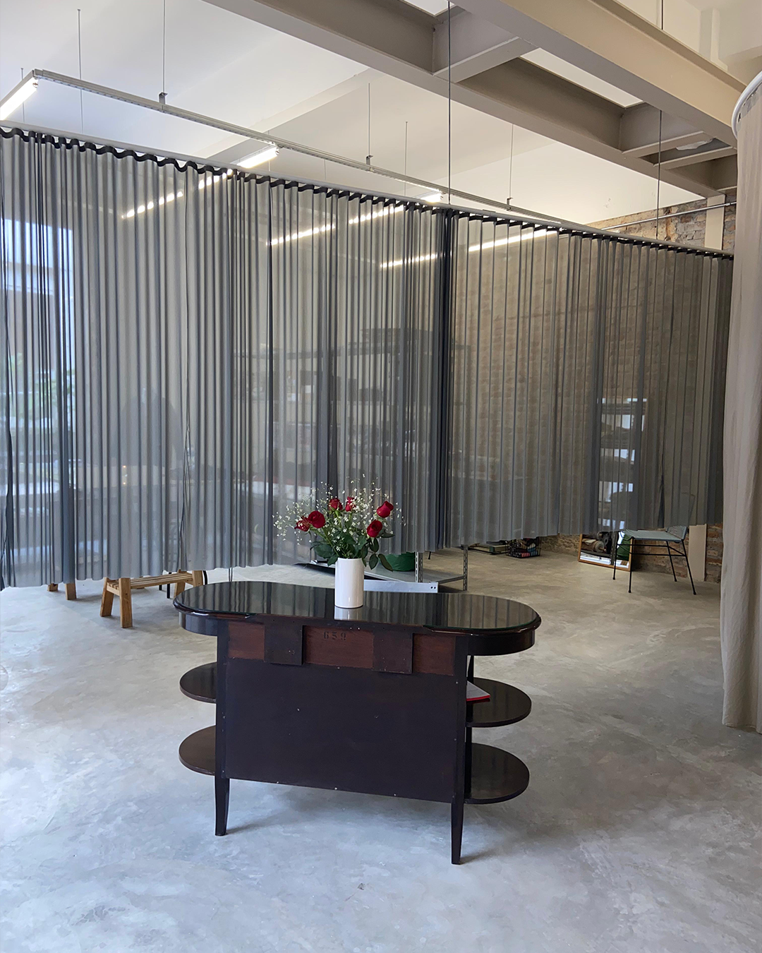
The store’s interior architecture was signed by CLUBE, whose spatial design echoes the same tension between tradition and innovation.
For the opening of ÃO’s new atelier–store–showroom at LAPI, I designed the launch poster that introduced the space to the public and marked a new phase of the brand’s physical presence. The visual concept appropriates an 18th-century engraving of a tailor, recontextualized as a symbolic bridge between craftsmanship and contemporary design.
The store’s interior architecture was signed by CLUBE, whose spatial design echoes the same tension between tradition and innovation.
@ÃO @Late 2025
![]()
![]()
![]()
![]()
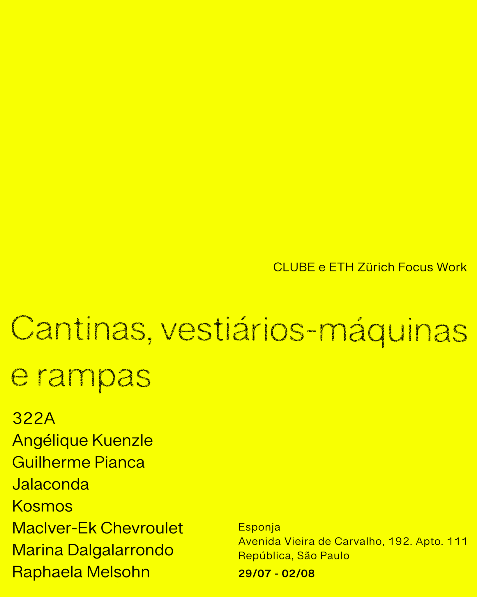
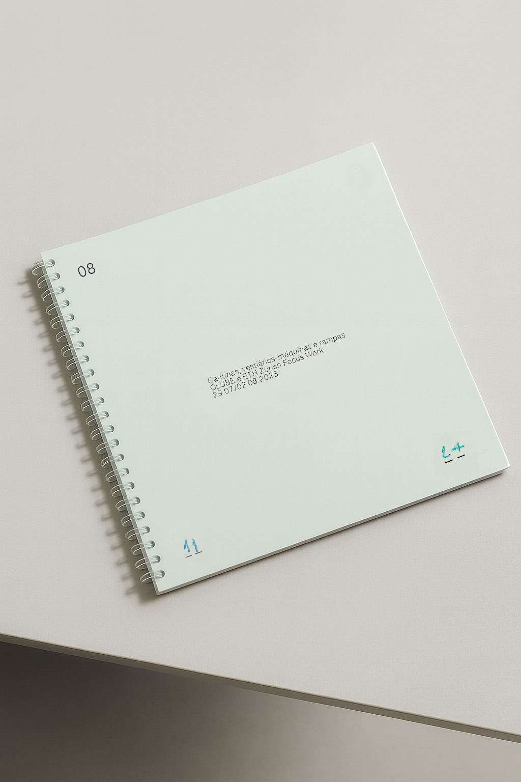
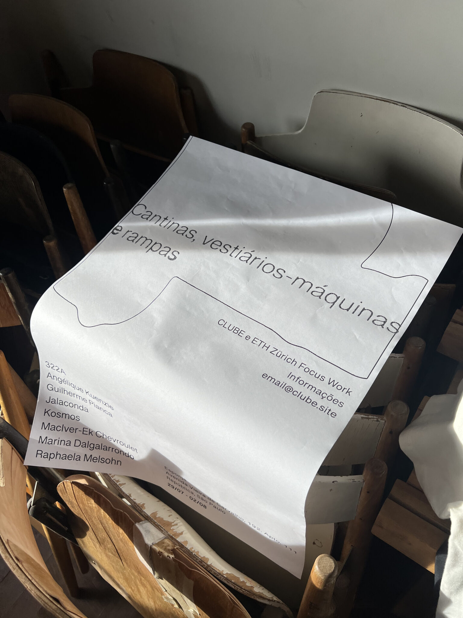
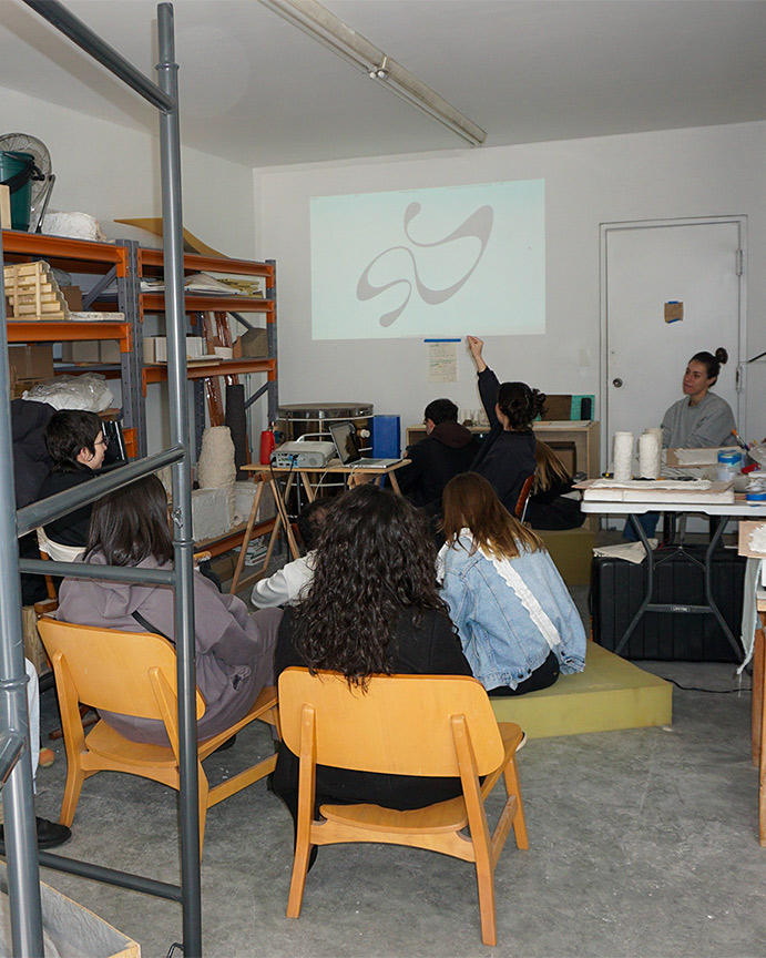
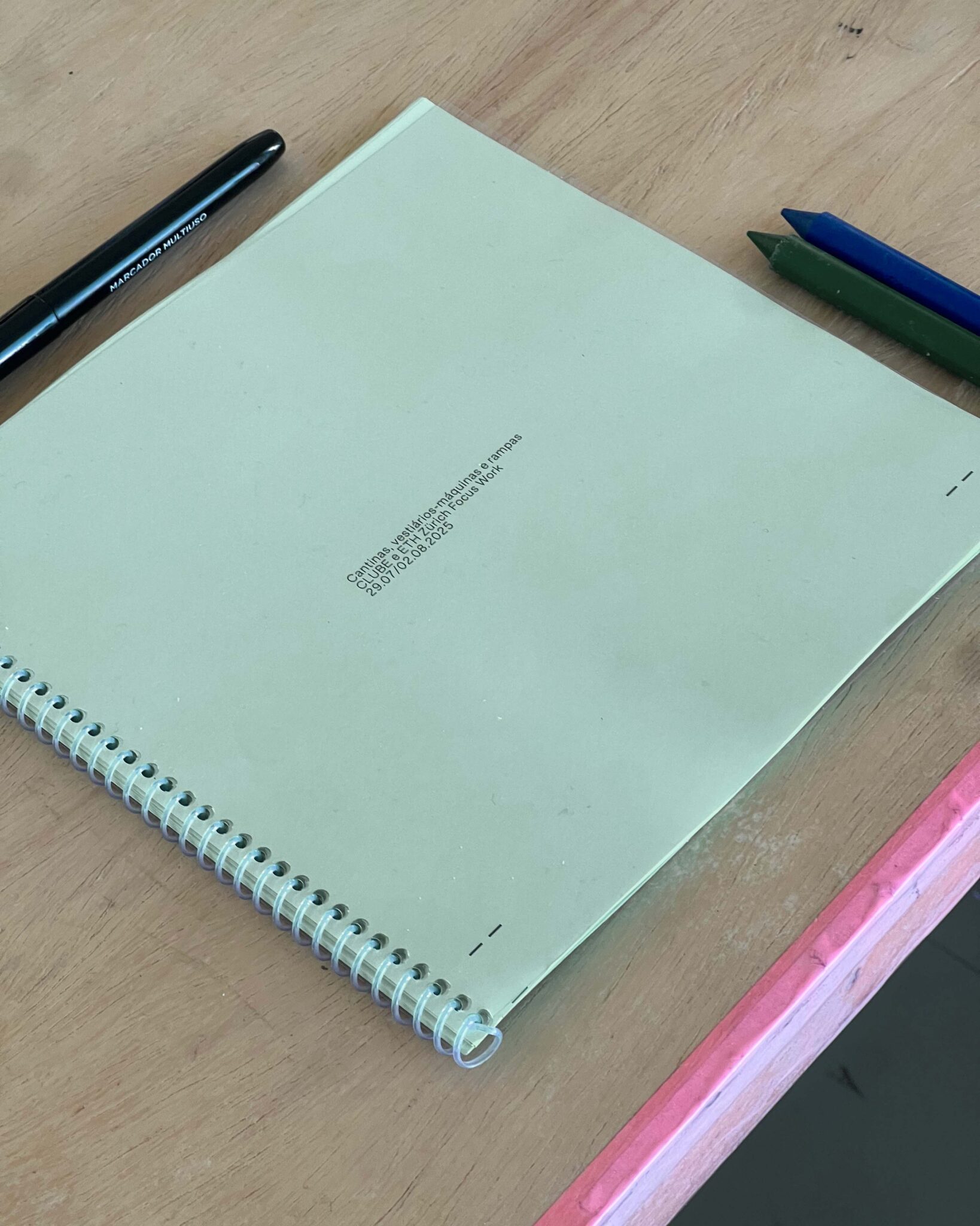
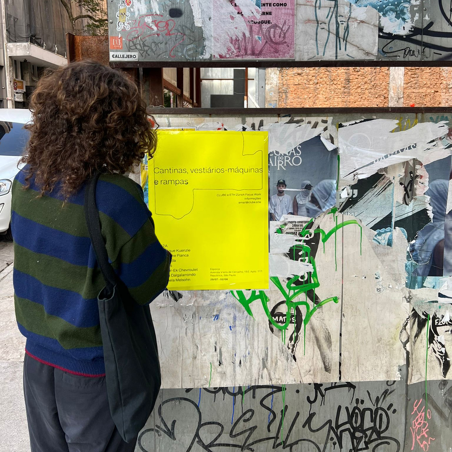
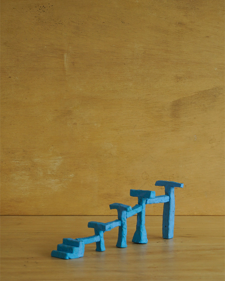
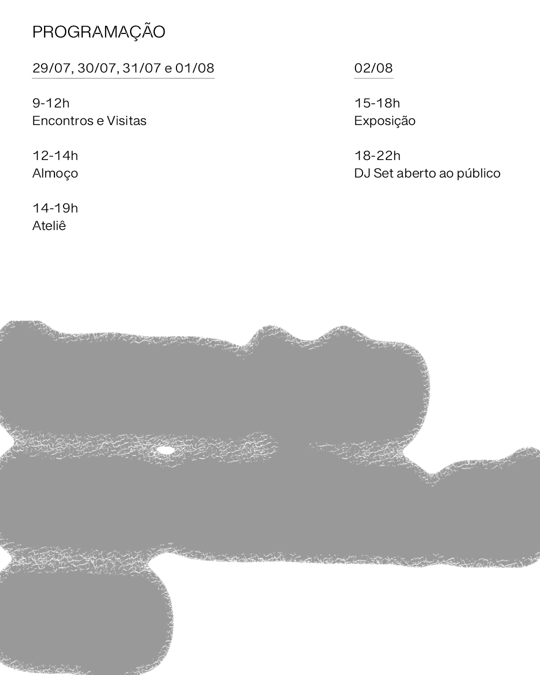
Canteens, locker-room machines and ramps (CLUBE & ETH Zürich)
Canteens, locker rooms-machines and ramps was a space-and-object workshop organized by CLUBE and ETH Zürich’s Department of Architecture, with visual identity and communication strategy developed by CCarta.
The participants were invited to explore elevated spaces related to sports, work and leisure practices, and then develop objects that could support or expand these activities. Held over four meetings in a dance studio on the rooftop of a downtown building in São Paulo, the workshop was structured daily in two moments: lectures (with guests from different fields of knowledge) and studio sessions. In the end, the works were presented in a open-to-the-public party-exhibition on the same rooftop, a sort of “metalinguistic wrap-up” to expand even further the core concept of the workshop: the city relations, elevated.
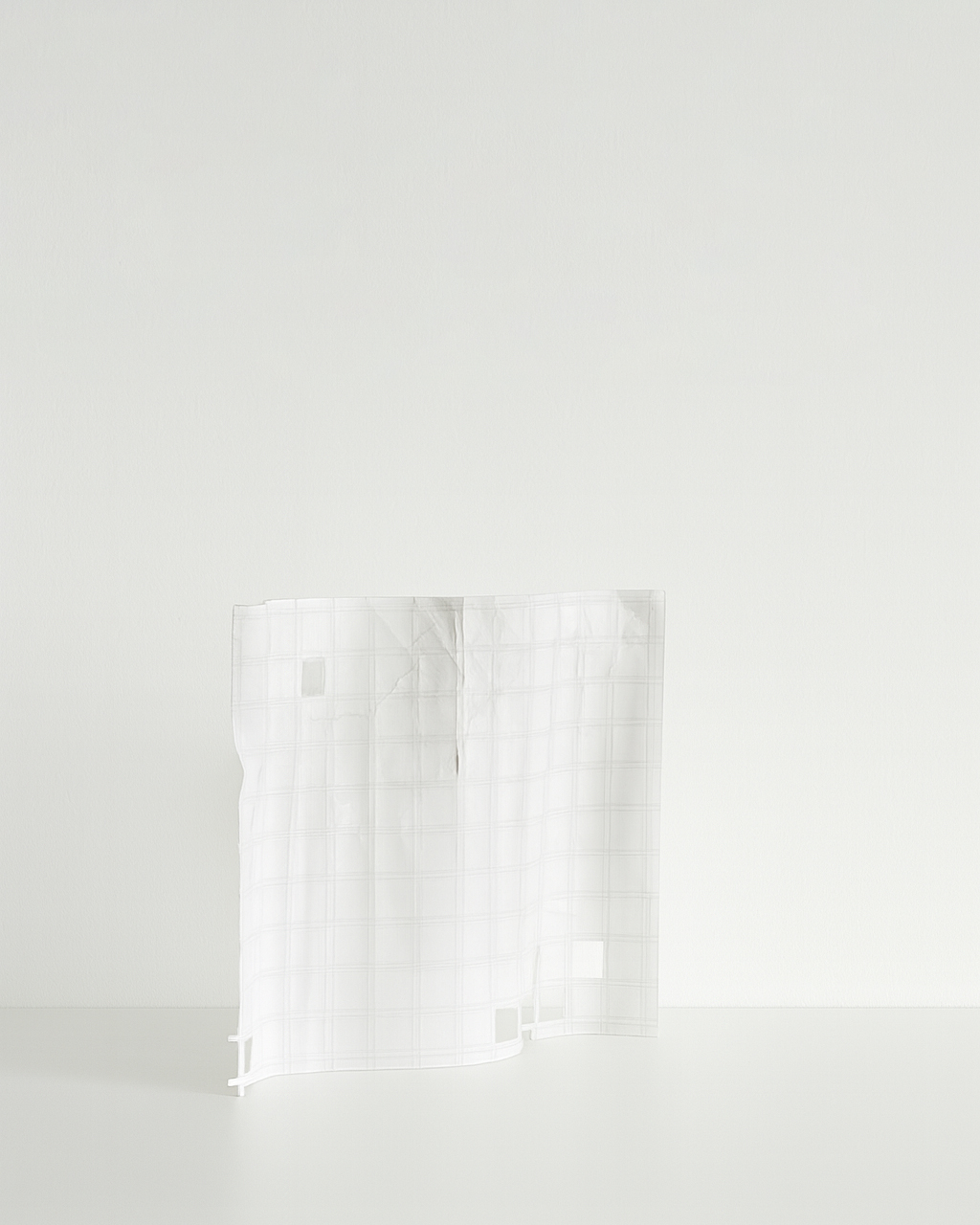
The design took inspiration from the physical traces of urban production and process, using typography, colors, and other visual elements that reference architectural documentation and action — such as technical sketches (including Paulo Mendes da Rocha’s original 2000 drafts), architectural blueprints, and “under construction” urban signage.
To promote the workshop, we wanted to step outside the digital realm and play in the physical world for a change — putting up posters in places that share the same social energy we hoped to “bring into the classroom”: bars, cafés, and schools. For the outdoor identity, we chose a bold yellow as the centerpiece. This punchy, monochromatic tone, paired with a quiet (almost sleepy) layout that contrasted with the maximalist chaos of most of the city’s advertising, allowed the workshop’s form to match the strength of its content.
For the workshop itself, we aimed for neutrality: materials were either plain white or a light shade of blueprint-like green.
Guest Lecturers:
322A, Angélique Kuenzle, Guilherme Pianca, Jalaconda, Kosmos, MacIver-Ek Chevroulet, Marina Dalgalarrondo and Raphaela Melsohn
Canteens, locker rooms-machines and ramps was a space-and-object workshop organized by CLUBE and ETH Zürich’s Department of Architecture, with visual identity and communication strategy developed by CCarta.
The participants were invited to explore elevated spaces related to sports, work and leisure practices, and then develop objects that could support or expand these activities. Held over four meetings in a dance studio on the rooftop of a downtown building in São Paulo, the workshop was structured daily in two moments: lectures (with guests from different fields of knowledge) and studio sessions. In the end, the works were presented in a open-to-the-public party-exhibition on the same rooftop, a sort of “metalinguistic wrap-up” to expand even further the core concept of the workshop: the city relations, elevated.
The design took inspiration from the physical traces of urban production and process, using typography, colors, and other visual elements that reference architectural documentation and action — such as technical sketches (including Paulo Mendes da Rocha’s original 2000 drafts), architectural blueprints, and “under construction” urban signage.
To promote the workshop, we wanted to step outside the digital realm and play in the physical world for a change — putting up posters in places that share the same social energy we hoped to “bring into the classroom”: bars, cafés, and schools. For the outdoor identity, we chose a bold yellow as the centerpiece. This punchy, monochromatic tone, paired with a quiet (almost sleepy) layout that contrasted with the maximalist chaos of most of the city’s advertising, allowed the workshop’s form to match the strength of its content.
For the workshop itself, we aimed for neutrality: materials were either plain white or a light shade of blueprint-like green.
Guest Lecturers:
322A, Angélique Kuenzle, Guilherme Pianca, Jalaconda, Kosmos, MacIver-Ek Chevroulet, Marina Dalgalarrondo and Raphaela Melsohn
@CCarta + CLUBE @Mid 2025
![]()
![]()
![]()
![]()
![]()
![]()
![]()
![]()
![]()
![]()

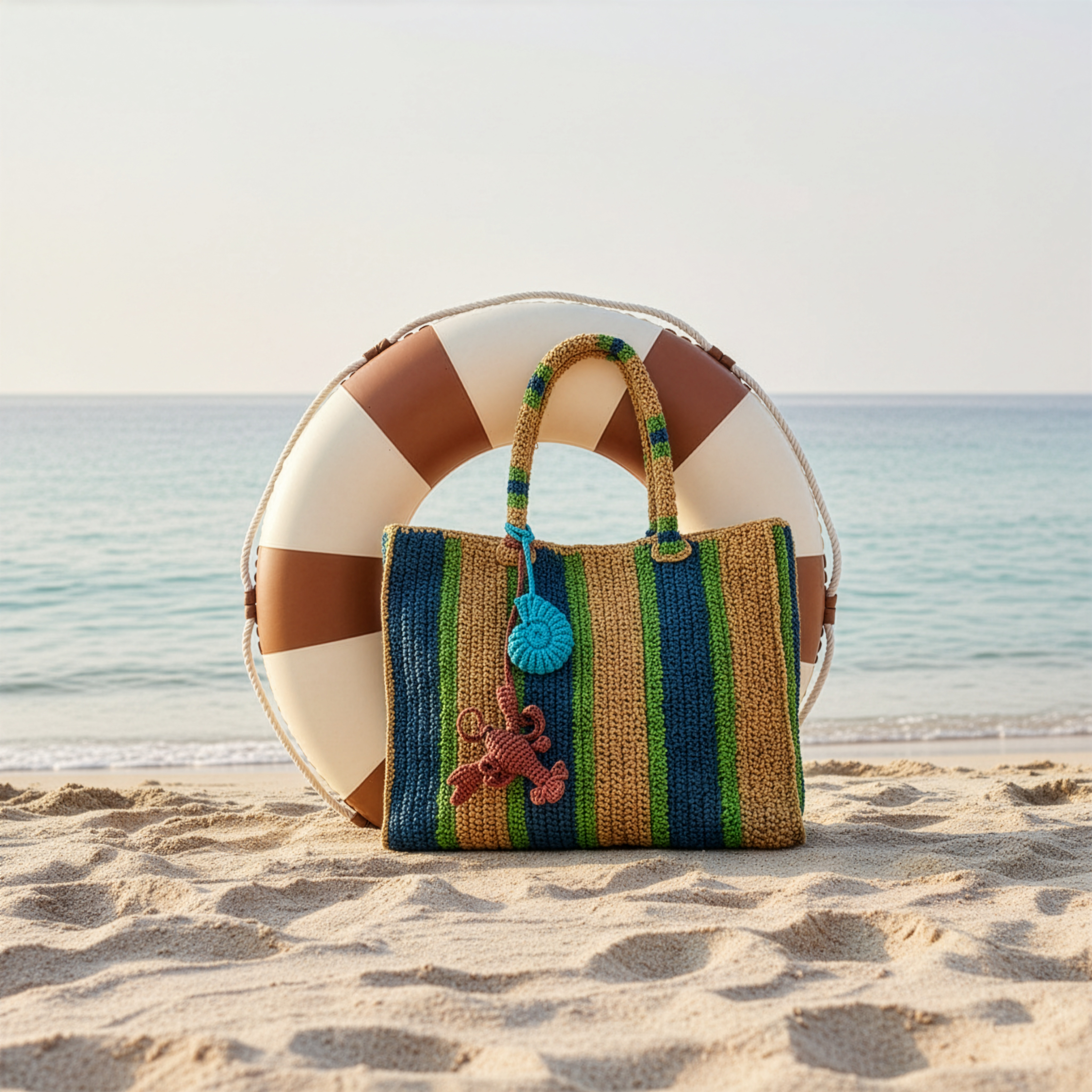
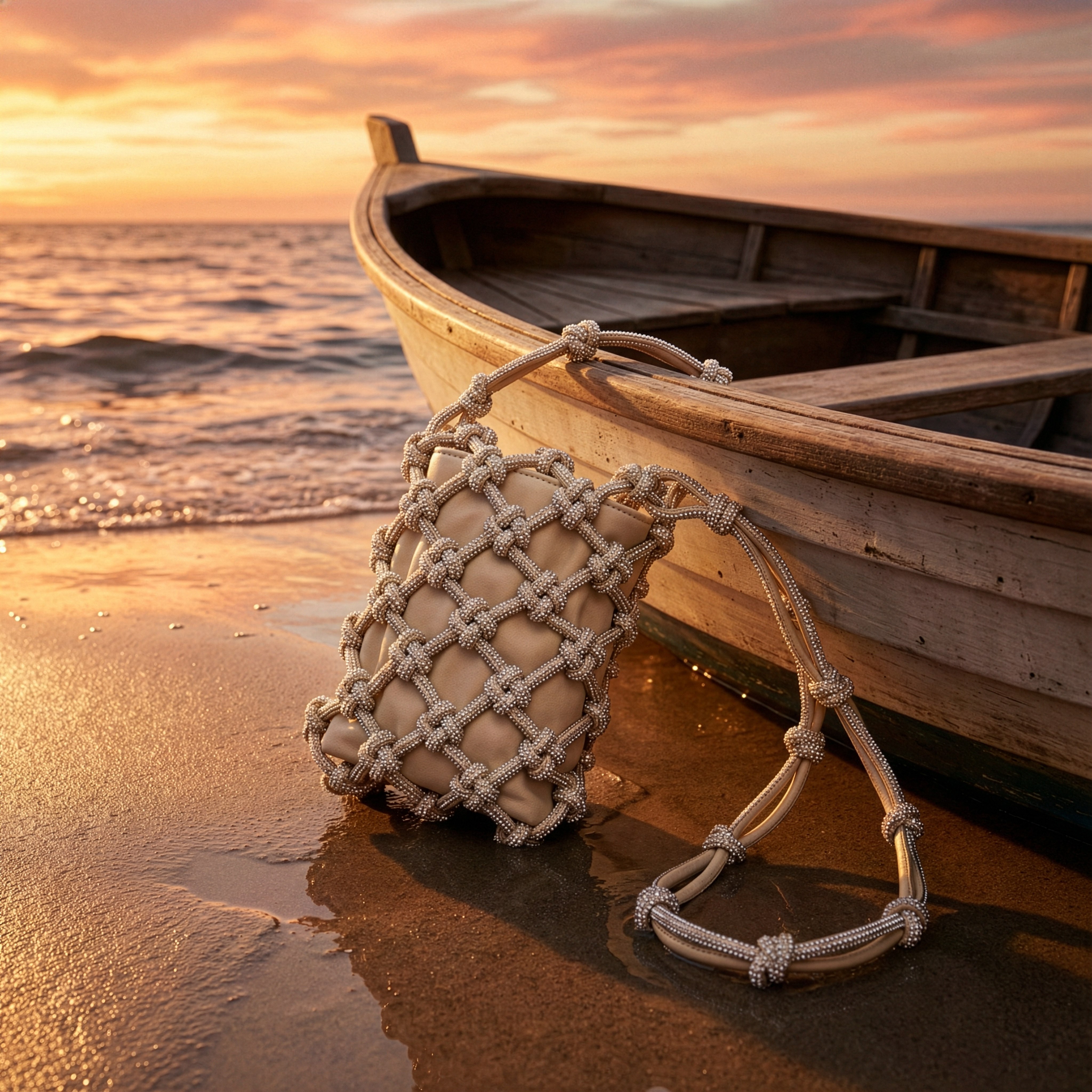
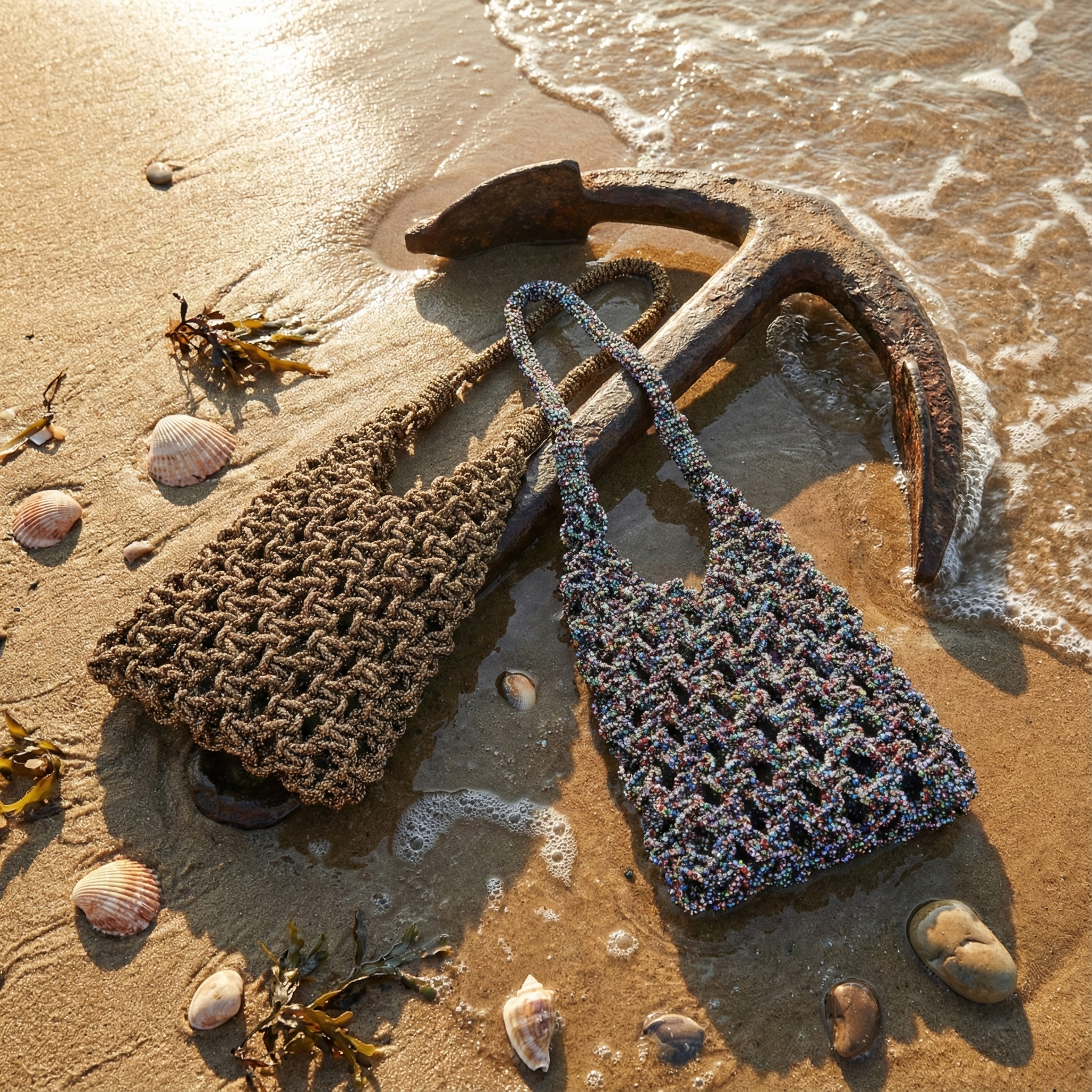
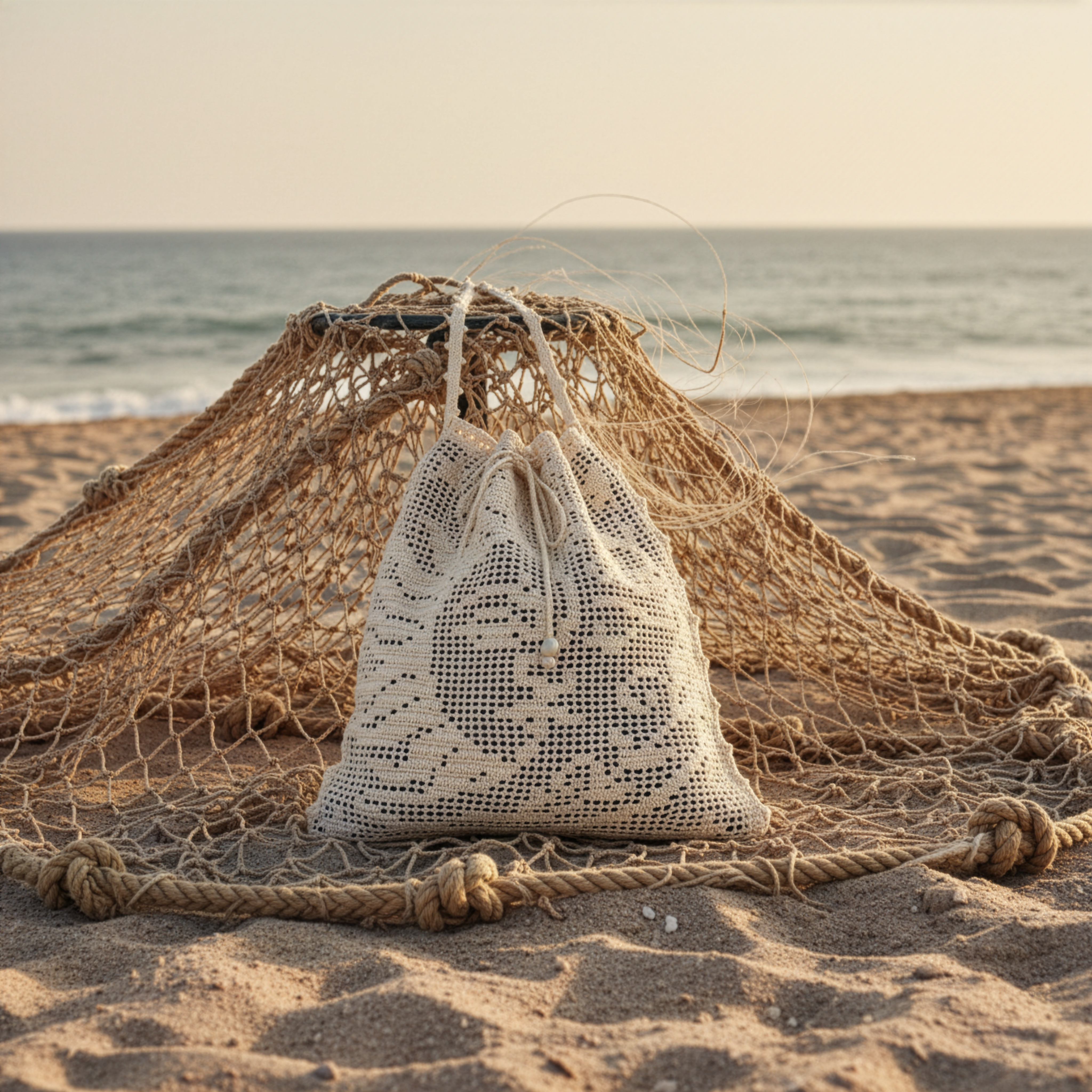
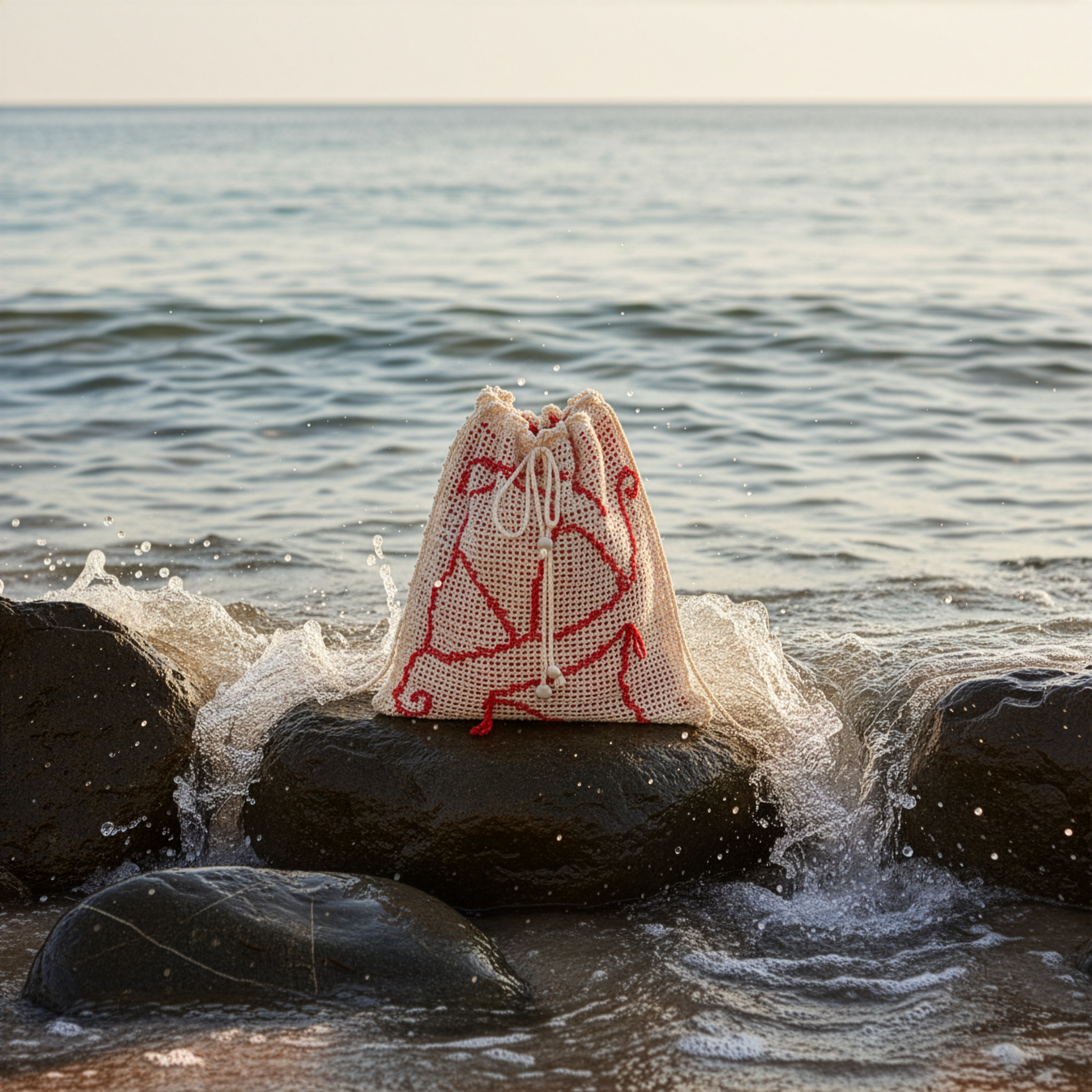
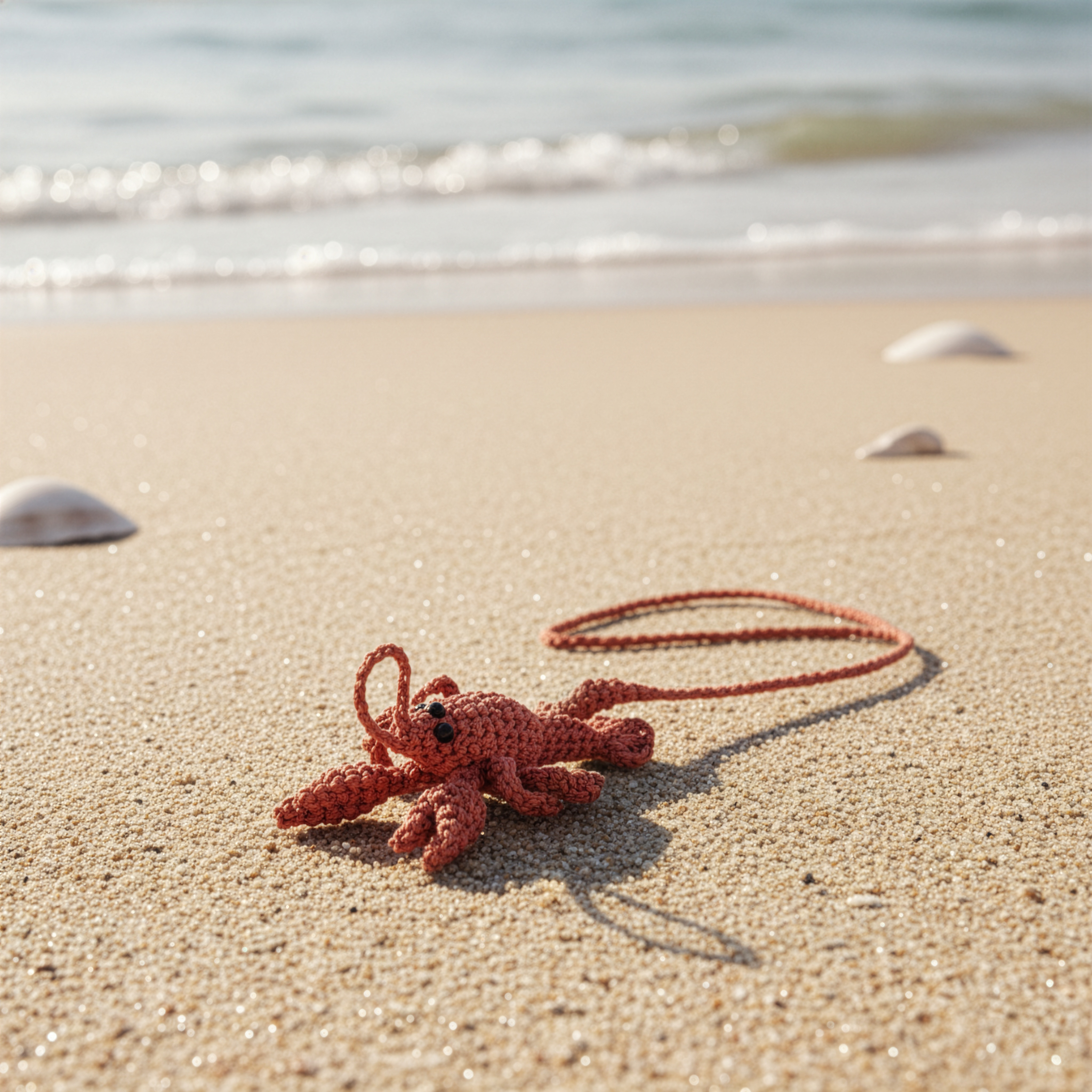
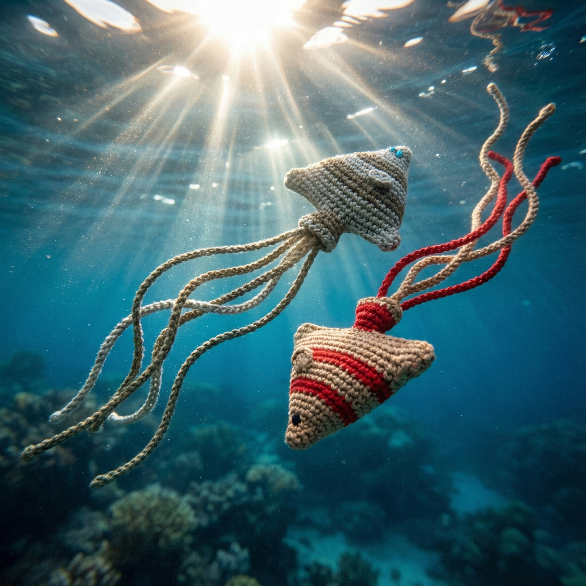
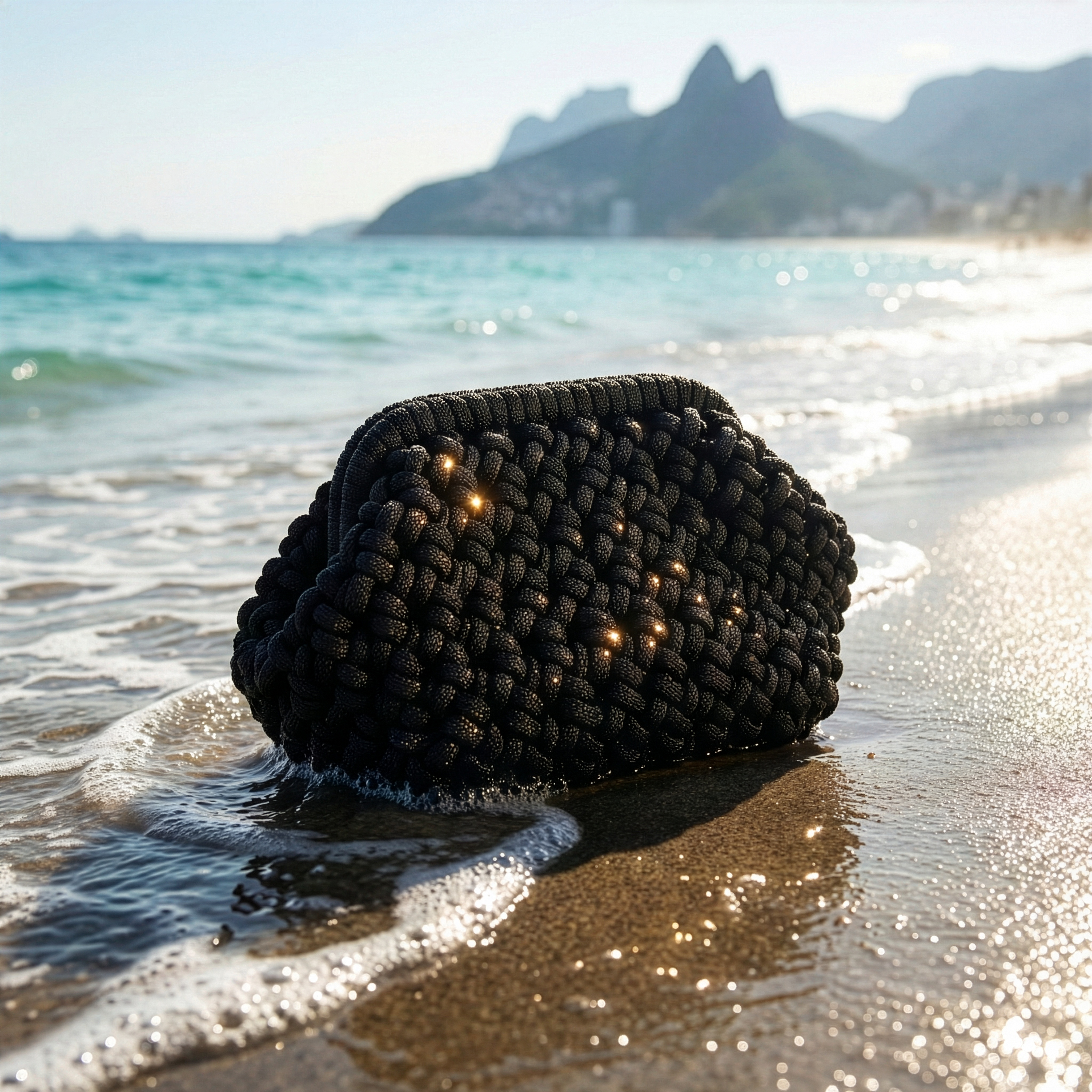
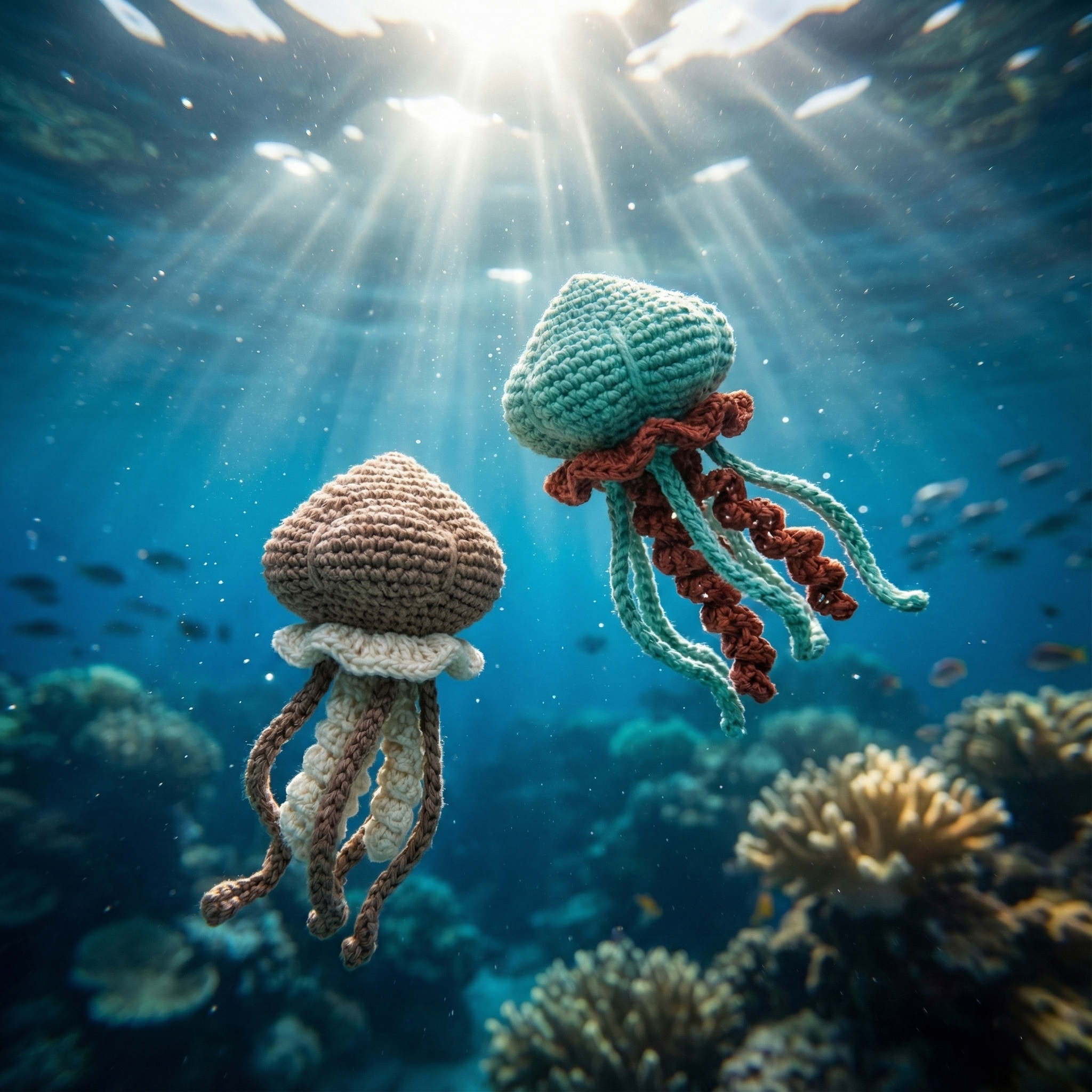
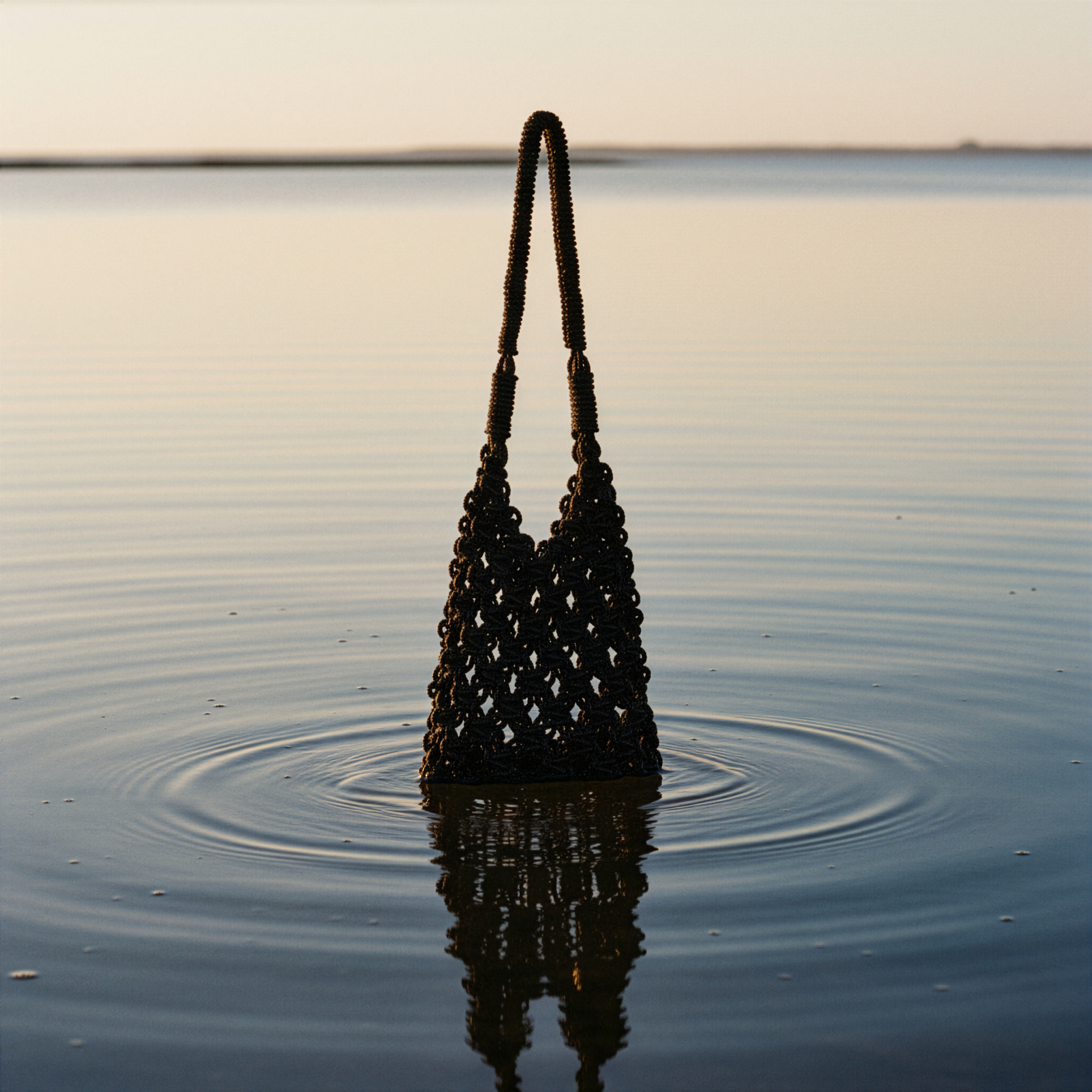
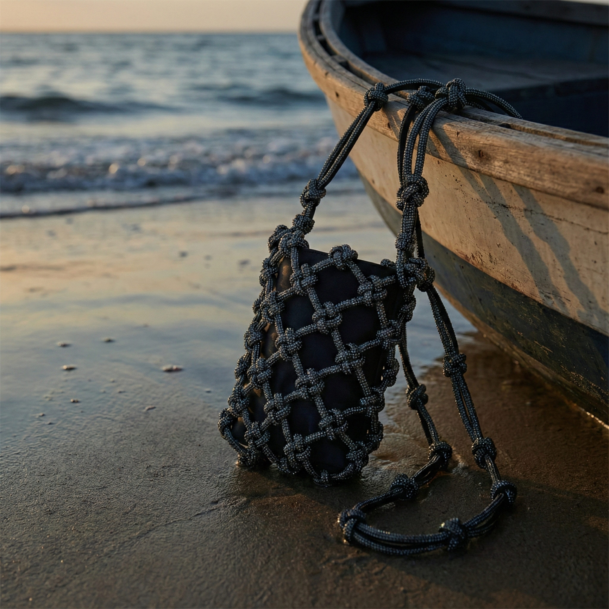
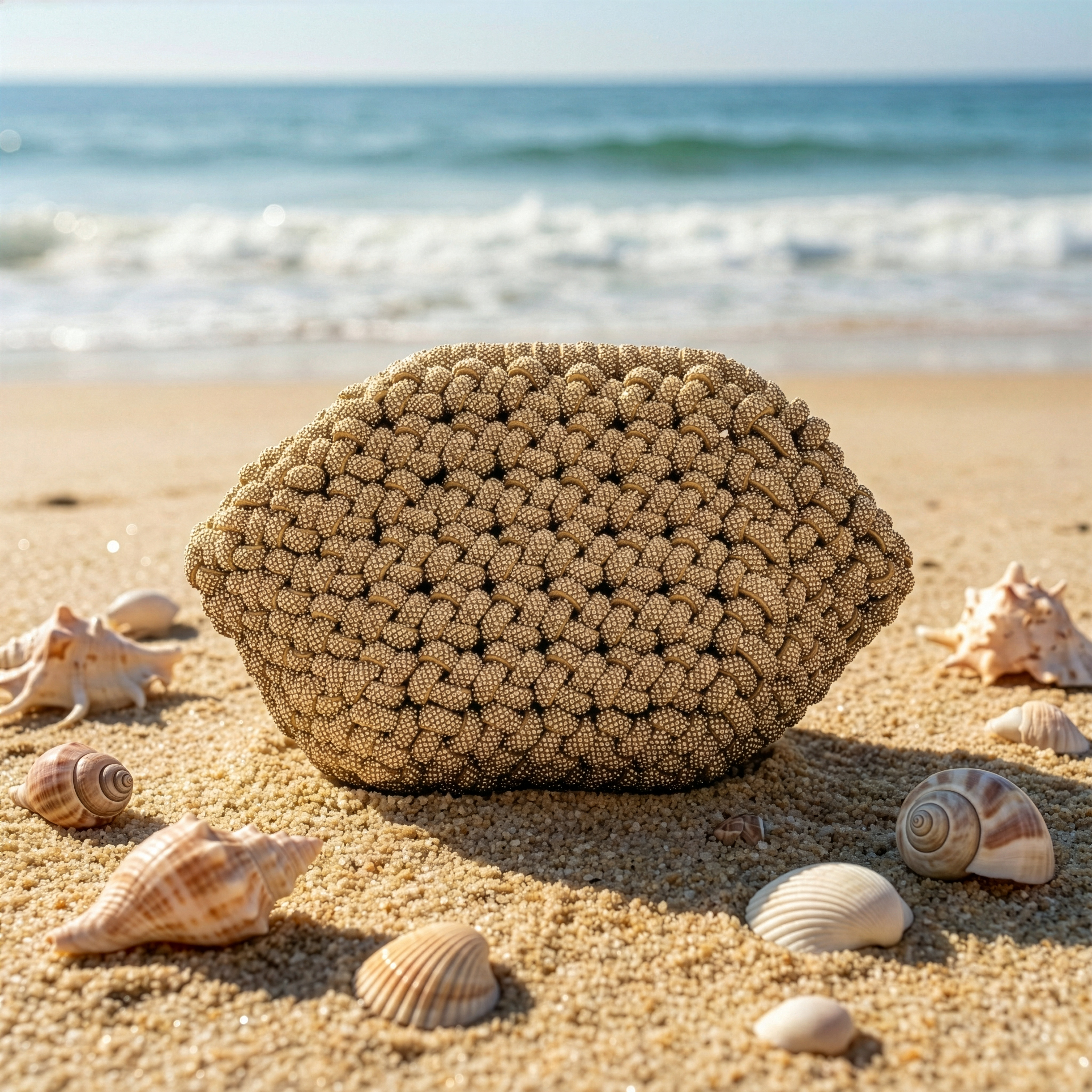
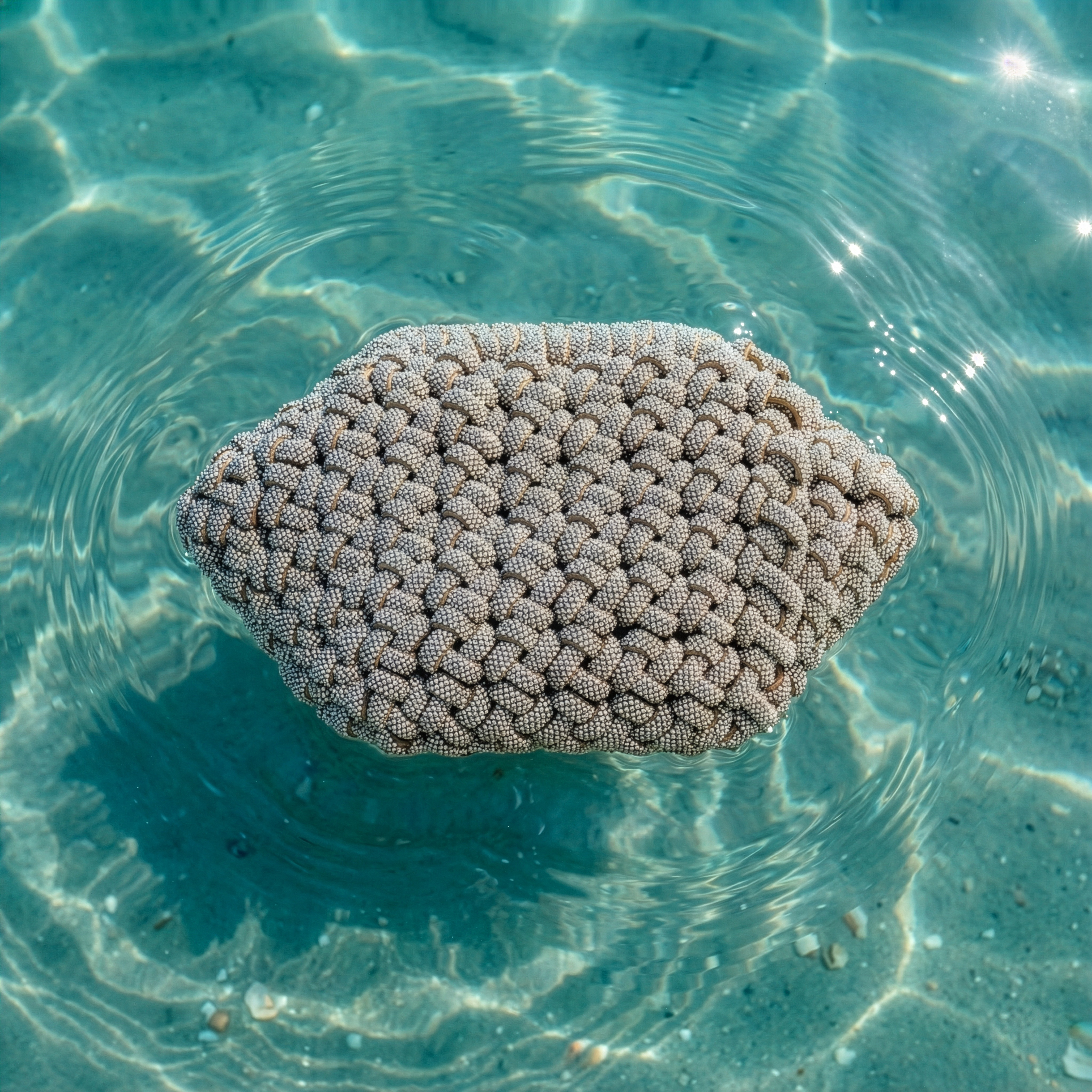
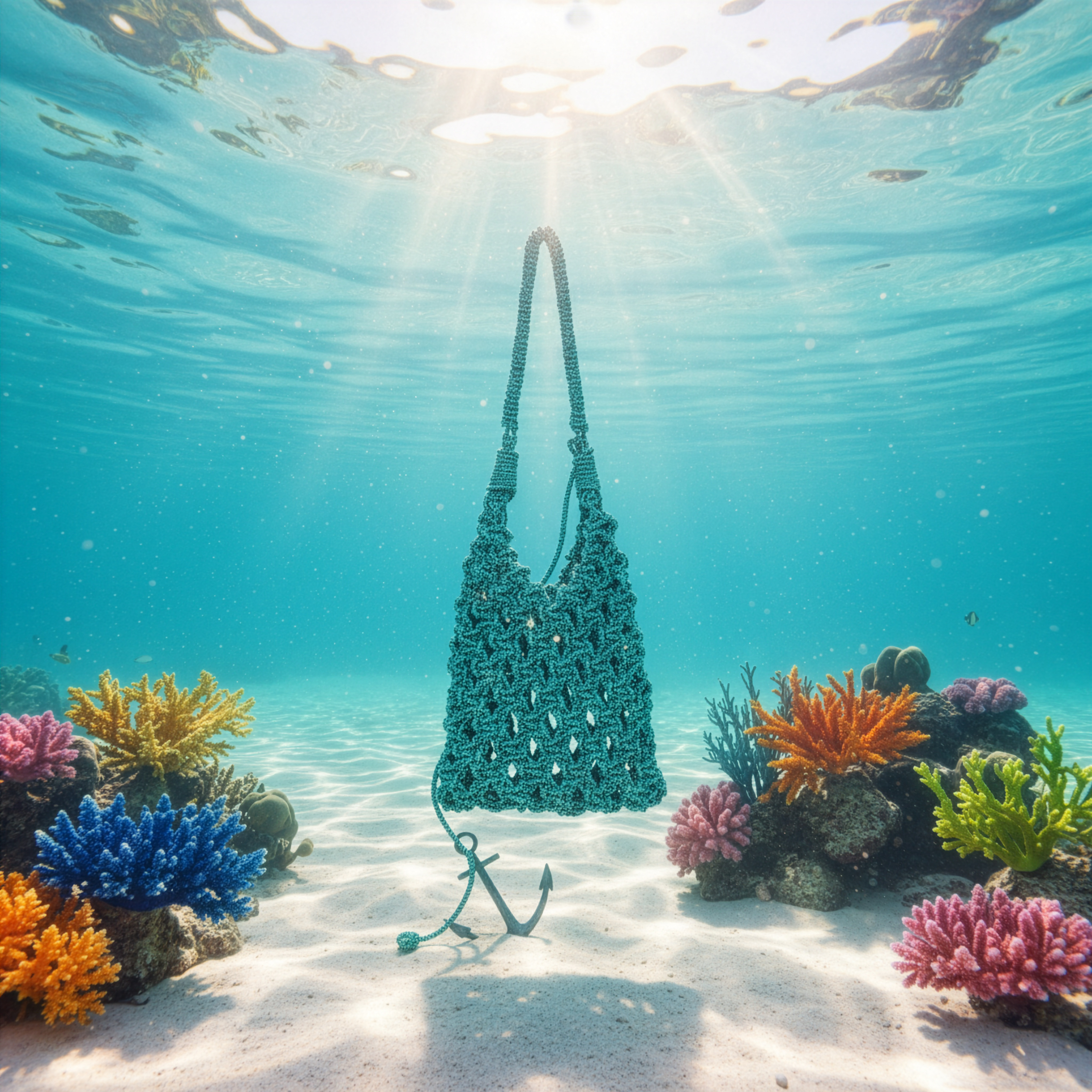
Mil Linhas SS26 AI-Driven Campaign
In 2025, I developed the full Spring Summer campaign for Mil Linhas, a Brazilian accessories brand known for its contemporary silhouettes and bold visual language. Built entirely with AI-generated photos and videos, the project expanded the brand’s aesthetic range while preserving a cohesive and recognizable identity.
The campaign was shaped through carefully crafted prompts that defined its concept, mood and visual tone. Each output was refined through adjustments in lighting, texture and composition to create a polished and aspirational look aligned with the sculptural and sensorial qualities of the brand.
The result is an AI-driven campaign that feels human, crafted and emotionally resonant, showing how technology can enhance creative direction while staying true to Mil Linhas’ essence.
@Freelance @December 2025
![]()
![]()
![]()
![]()
![]()
![]()
![]()
![]()
![]()
![]()
![]()
![]()
![]()
![]()
![]()

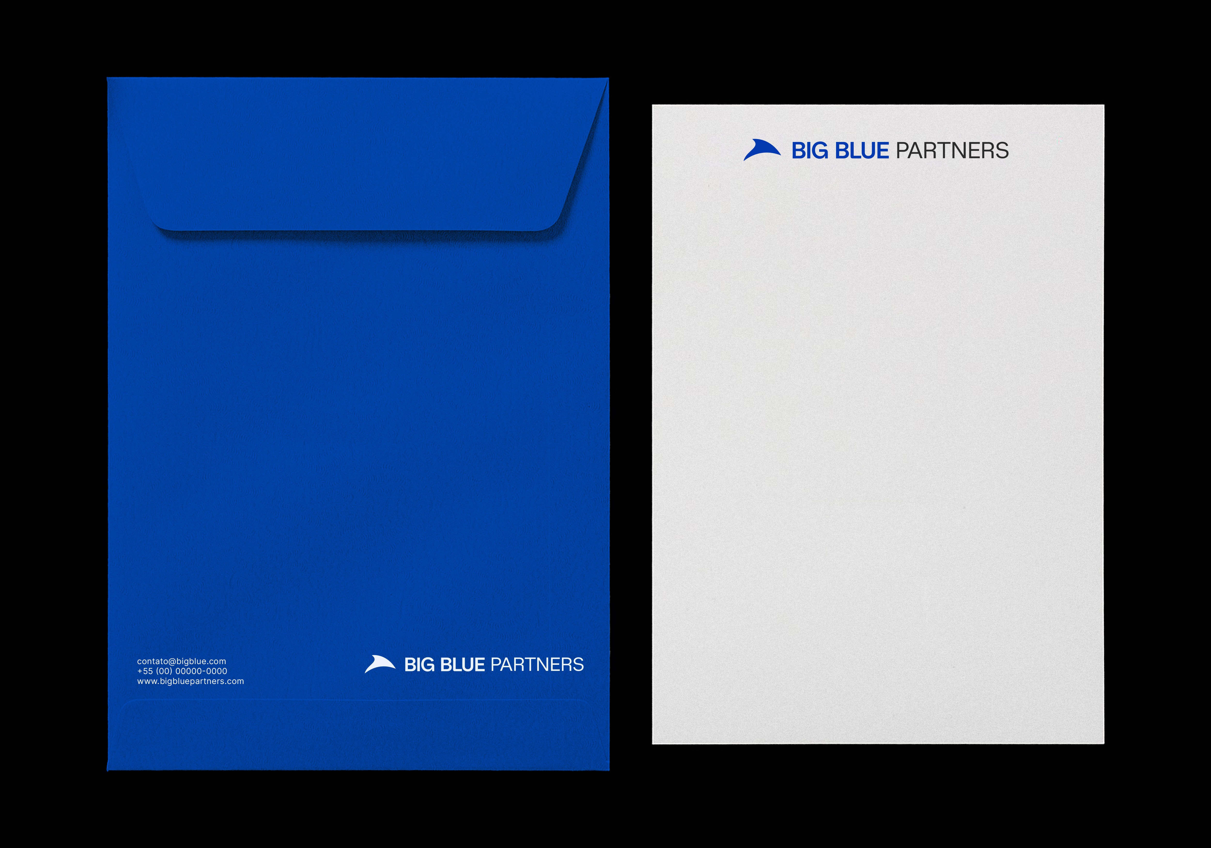
Big Blue Partners
Big Blue Partners is an independent advisory firm, with vast experience in M&A and Credit operations.They work together with companies worldwide to maximize value during decisive moments. In 2024, I developed their visual identity.
Big Blue Partners is an independent advisory firm, with vast experience in M&A and Credit operations.They work together with companies worldwide to maximize value during decisive moments. In 2024, I developed their visual identity.
@Freelance @Late 2024
![]()
![]()
![]()
![]()
![]()
![]()
![]()
![]()
![]()
![]()
![]()
![]()
![]()
![]()
![]()
![]()
![]()